
Introducing ... districks!
It's July of 2017, and redistricting lurks as a gigantic issue at the national, state, and local level – but there also lurks a gigantic gap in the coverage. Articles get written, TV and radio segments get recorded, and these stories revolve around maps, yet the maps in question are usually nowhere to be seen.
As often as not, we'll see a photo of a gavel, or a voting booth, or the front of a courthouse building. But no matter how nicely composed the photo of the court building may be, it tells us nothing about the real story.
When we do get a map, they tend to be small, static, and hard to decipher.
Enter ... districks.com.
This new site will put the maps front and center, and in such a way that they can be explored and understood.
On top of interactive maps, districks will provide animations and video to help explain concepts ranging from the basic to the intricate.
Not that we'll be forgetting about writing. So many key aspects of the gerrymandering skullduggery haven't been adequately explained for a mass audience. On districks, you can look forward to compelling writing with an emphasis on data journalism, on visualizations of the information, and with a constant eye on the key analytic question that other outlets ignore: 'Compared to what?'
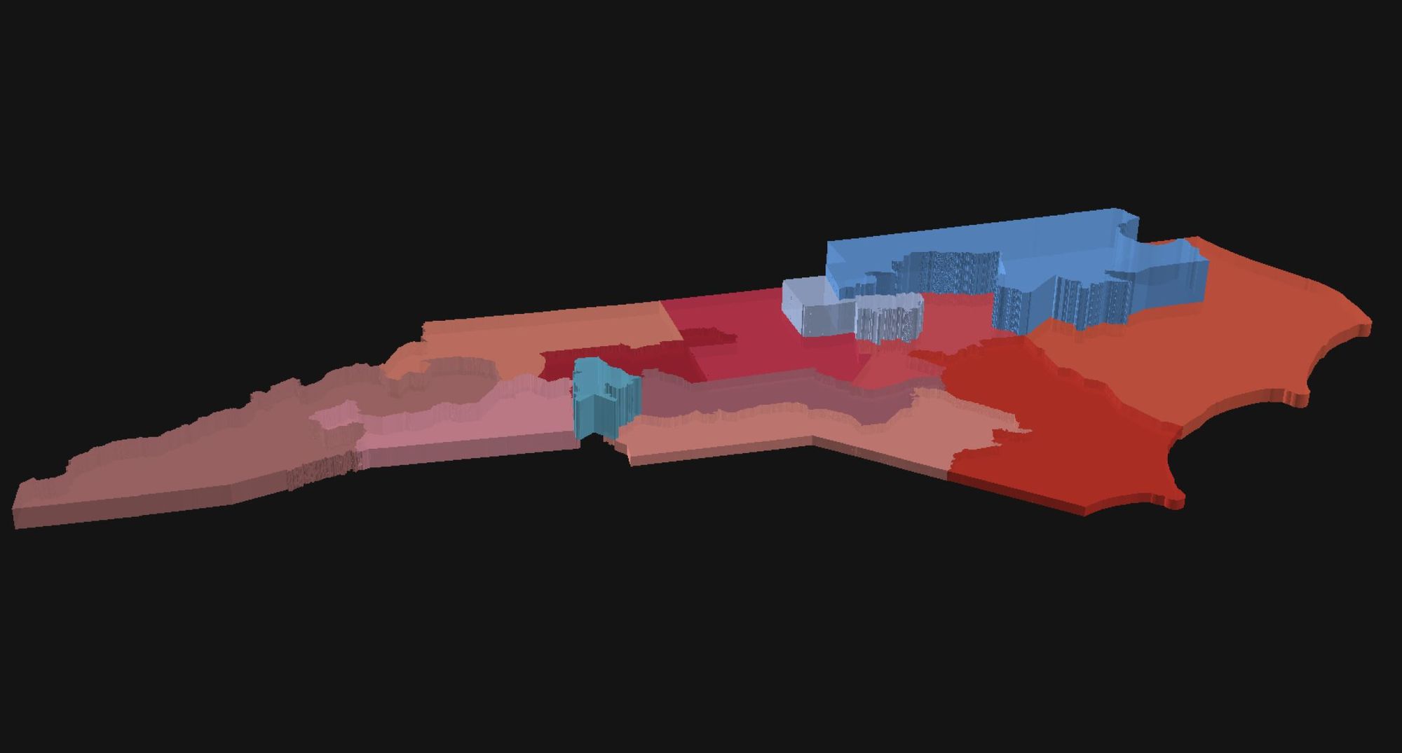
Initially, we anticipate a focus on North Carolina, but we look forward to applying the similar investigation and illumination to all the other states where crooked mapping needs more scrutiny.
We hope you'll join us.
[There's a little more about the background of this initiative on the site's About page.]