We Need More Information About the NCGA Proposed Maps

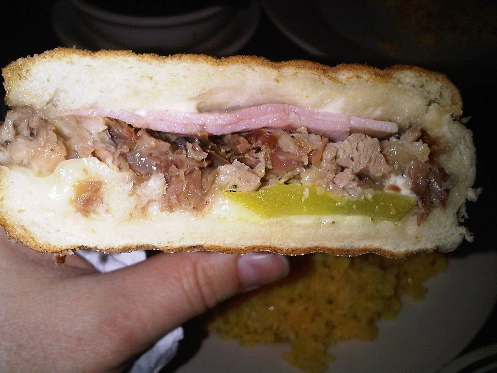
Imagine that your child's school cafeteria had recurring problems last year with food poisoning and peanut contamination (despite a no-peanut-allergen requirement). Then imagine that the cafeteria announced that it was allowing public scrutiny and investigation – by letting parents look at some photos of newly prepared dishes of food.
That's what the General Assembly's release of PDFs of maps is like.
Yes, the PDF maps allow us to identify double-bunkings. And yes, some clever observers have been able to deduce some political ramifications.
Remember, the previous maps were struck down on the basis of racial gerrymandering. I have yet to see any tweets or stories about how the new maps address this issue.
And that's because to do that analysis right, a person needs the "stat pack" (a series of tables of numeric data) as well as ideally the shapefiles (details of the geometry that can be plugged into mapping software).
Evidently these will be released Monday, the day before the public hearings.
Here's the thing: I've worked with this software before, and generating the stat pack and exporting the shapefiles is something routine that can be accomplished in minutes, not days. It might take about 10 mouse clicks.
I suppose a photo of some cafeteria food might help if the food is obviously rotten. But to really assess its safeness for consumption, other analysis is needed.
Sometimes taking a whiff can help too – these maps already seem to be failing the smell test.
Sandwich photo by Kim via Flickr, under CC BY-SA 2.0 license.
