
Differences in Congressional District Population *Between* States: a Prologue
The populations of different states' Congressional districts vary widely, but there are some interesting patterns in that variation.

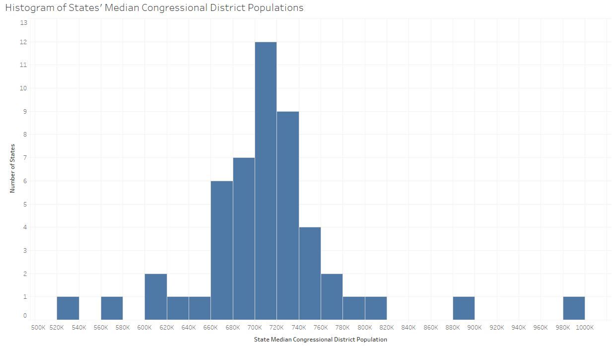
It shouldn't come as a big surprise to this blog's typical audience that Congressional districts vary widely in population. As others have long noted (with cleverly titled pieces like "A House poorly divided"), our system allows for Montana's one representative to have 989,415 constituents, while Rhode Island's less populous district has only 526,283. That said, most districts are nearer the sweet spot of 708,377—which is what you get if you divide the total population of the 50 states by the total number of districts (all numbers above and below are based on the 2010 Census and the districts for the current, 115th Congress).
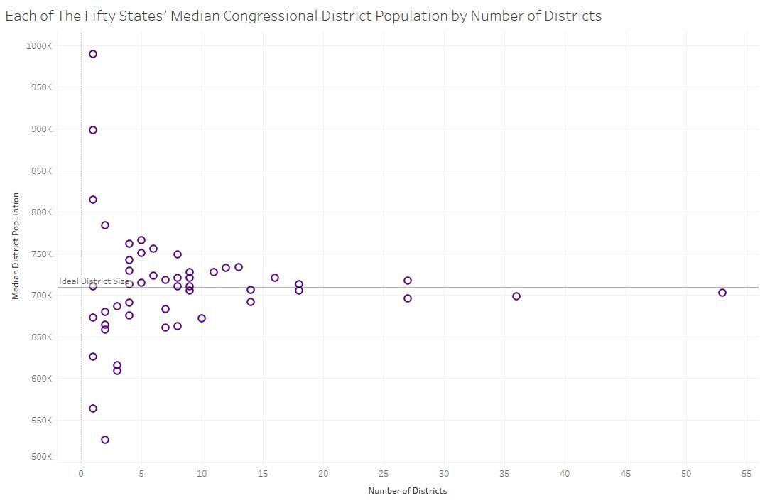
And mathematically inclined folks may be thinking, or may already be aware, that the more districts there are in a state, the smaller the possibility of deviation from the ideal. In the graphic below (turned 90° to emphasize that it's not a histogram), you can see that for states with more than 3 districts, the deviation is less than ±10%, and for states with more than 10 districts, it's under ±5%. There's also an interactive version that lets you hover, identify states, and explore the numbers.
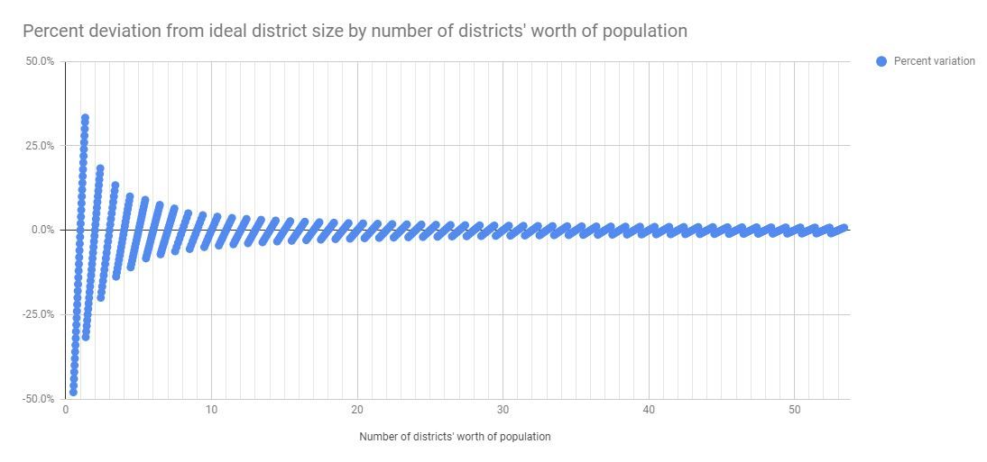
That tapering pattern is an inescapable consequence of the way we do apportionment in the US. The graphic below is admittedly a simplification, based on the largest remainder method (devised by Alexander Hamilton—that's what I'm talking about!) instead of the Huntington-Hill Method. It shows more generally the maximum deviation outcomes for a state mean district population.
I just noticed how much that looks like a screw—no joke. I also made a slightly modified (and interactive) version of the scatterplot graphic above that, if you look closely, reflects the slanting threads of the screw using the state population totals instead of the number of districts.
Some of you may have been asking, "Why is he using the median district population for each state instead of showing all the districts' populations?" It's a good question. The topic of how Congressional district populations differ within a state is actually what interests me much more, as it has more bearing for redistricting constraints. I intend to write a post on that soon, but I figured it made sense to summarize this variability, that is, between states, first. I'll update this post with a link when that post is published.